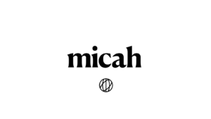
At Micah Australia we are excited to welcome a new look! A new Micah brand and website that we believe more accurately captures the essence of who we are and where we’re going, together.
The Why
Over the course of many heartfelt conversations, reflecting on all we’ve achieved together and what we continue to believe God is calling us to do, we have created a new visual identity.
One that seeks to reflect our momentum as a unified movement of Australian Christians, advocating on the most pressing global justice issues of our time.
The essence of Micah that we hope to capture with our new brand, is one of being globally minded and focused on justice, togetherness, empowerment, and hope, all with the Christian faith at its core.
Being 6-years old, our previous branding served its purpose. But it no longer fully captured the growth and development that we have so gratefully experienced in this time.
We want to ensure that our branding is relatable, modern and a strong reflection of professionalism with which Micah advocates conduct themselves as we seek to engage Australia’s political leaders warmly and respectfully.
We feel strongly to highlight our ‘global’ focus, which was a key factor in our updated logo design. The previous logo did not communicate that we are an organisation focused on global issues.
Practically, we wanted to create a core visual identity that would complement the several ‘sub-brands’ Micah has created in recent years, inclusive of our Women Leaders Network, Pacific-Australian Young Leaders Summit, and seasonal high-impact public campaigns.
We also want our visual content to complement that of our member organisations, avoiding any clashes with their dominant colours or styles, so that their unique work and impact can shine.
The What
The globe icon contains multiple layers of symbolism. The vertical strokes represent justice, mercy and humility— the core values of the bible verse Micah 6:8 from which all of our actions flow. The diagonal strokes symbolise a coming together of Christians from differing ends of the political and theological spectrum in pursuit of a common goal. Together, the elements of the globe represent strength in community, wholeness and ecumenism, as we band together to see change.

We acknowledge the obvious change of no longer having a Christian cross motif in our logo. This is no reflection of a changing morale, our core beliefs or heart.
We remain an entirely faith-based, Christian organisation, with the core value of uniting Australian Christians for a more just world.
We believe the symbolism represented by our new visual identity remains a total reflection of the heart of Jesus, even more comprehensively so given who we are and how we work.
Still Us
Despite significant visual changes, the heart and mission of Micah Australia remains the same. We continue in our core mission to empower Australian Christians to be advocates for global justice.
We believe this refresh will build our capacity to achieve this mission in even greater ways and are excited for all that lays ahead. We look forward to having you on board as we launch this together!